![]()
Practical Notes
[work-in-progress]
For budgeting and execution, building One-Country.com can be divided into four independent phases, allowing the project to grow as funding permits.
1. Build an interactive online presentation for the polling group and the group discussions. (A reference set of designs are included below.)
2. Create a series of individual weblogs for each participant in the group, complete with photo essays of their locations and lives. Through the addition of this kind of journalistic detail we plan to flesh out the online portrait of the sample group. We will make use of mix of volunteers and professionals to generate the photo documentation for the website.
3. A package of documentary shorts featuring a selected subgroup of the participants. The video documentation of the project will both be distributed on the internet, in the form of 2 minute broadband clips, and on television, in the form of thirty minute documentaries.
4. Design online tools that encourage visitors to the site to join randomly selected and organized groups -- combining self selected individuals with people of contrasting beliefs in moderated forum discussion groups, using the tools of deliberation to recreate the democratic experience outlined in the poll project. In other words, letting people signup online to join moderated discussion groups that replicate the deliberative polling experience.
In addition, we can augment the online coverage of the poll project with a package of tools for basic civic education: how to register to vote; who your representatives are, by zipcode; political contributions, by zipcode; how the parts of government fit together; how to run for office.
Design Samples
Our goal in internet design is to create simple and culturally neutral ways to explore the sample group of American voters taking part in the deliberative poll. We intend to provide links to their opinions, to their personal profiles or blogs, and to present the deliberative process as they discuss issues within the group.
We've moved forward from these early samples by including webcams and videochat software as the basis for group participation. For more technical detail about those features, see Q & A. Note that text within these demo graphics relates to the earliest stage of concept. Current specifications are on the Q & A page.

Sample design portfolio begins here.
Additional notes from our design study are below:
Here is the about page. (Note that text within these demo graphics relates to the earliest stage of concept and is updated on the Q & A page.)
Jake Barton's notes on the design continue, with my comments in [brackets].
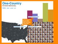
We have fleshed out the map, and distributed the "opinion colors" to all the little portraits.
[Notice the frames around the portraits register the answers to colors of the opinion response graph -- which would give a view of the country showing how opinion is distributed geographically.]
[The designer sketched in the map idea with just a couple of portraits, repeated. Also -- because US population is concentrated on the coasts, the density of portraits would fall differently than is indicated here.]
We have added rollovers to the map [allowing a visitor to "drill down" into the map and find out more about an individual]
We have made the poll cleaner, and more friendly
We have added rollovers to the poll.
We added a links pages for other content, and for user response to the polls, based off the orange square. The idea would be you could get to these links from the orange square at all times, it would be based on the question.
The blog pages look like a hybrid of the two designs from before, and use the same color of strongly agree > strongly disagree as before.
Here, for reference, the first design from Local Projects, Design A (1, 2, 3)